Each participant receives a final report to the evaluation of the EQA round.
This report is accompanied by other supplements, the list of which is given in the table at the end of the final report.
The supervisor's comment is also part of the final report.
Participants who did not submit their results also receive the final report, but without attachments.
The final report is public (available on the website).
| In the EQA Plan for the relevant year, you can find a list of documents for each EQA programme that will be attached to the final report.
The supplements to the final report are confidential and are intended only for individual participants.
|
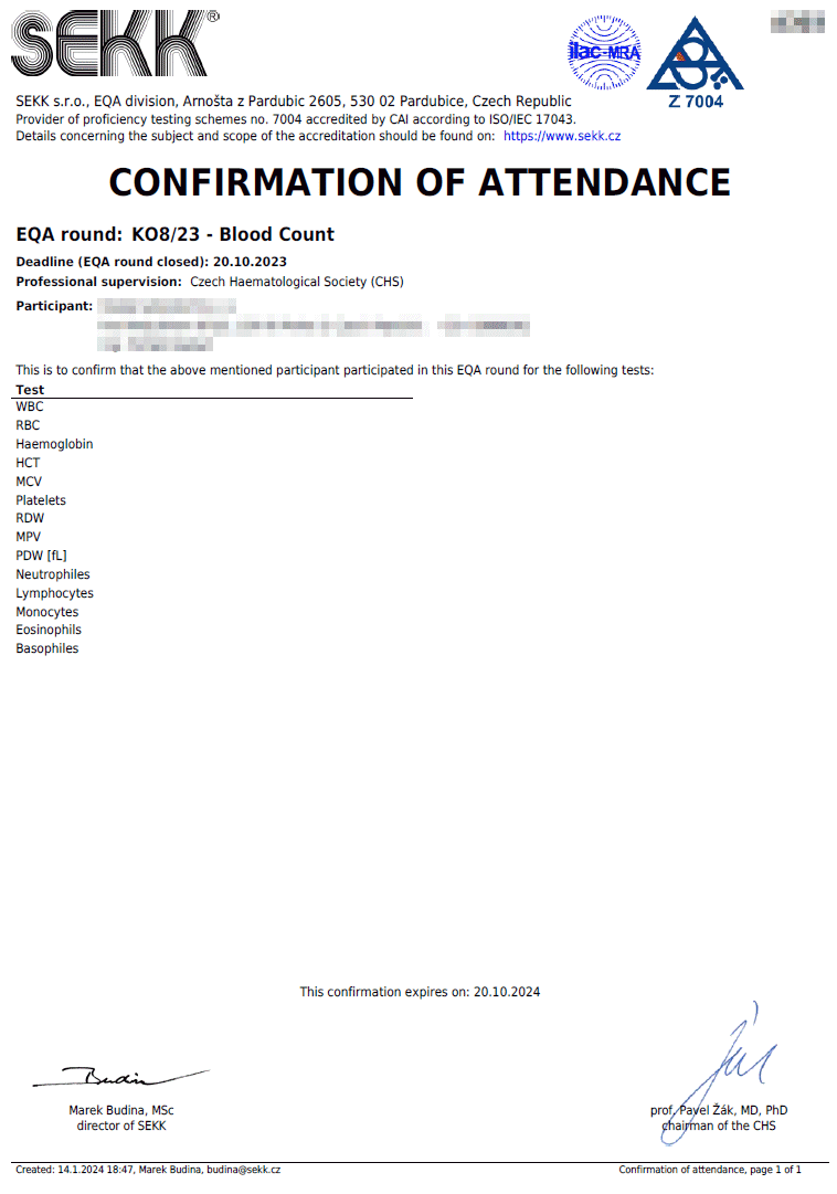
Confirmation of attendance
|
|
The conditions defining the rules for issuing confirmations of attendance are defined in the EQA Plan for the relevant year.
The confirmation of attendance contains a list of all the tests the results of which the participant has given, regardless of the accuracy of these results. This document serves as proof of participation in the relevant EQA round.
|
|
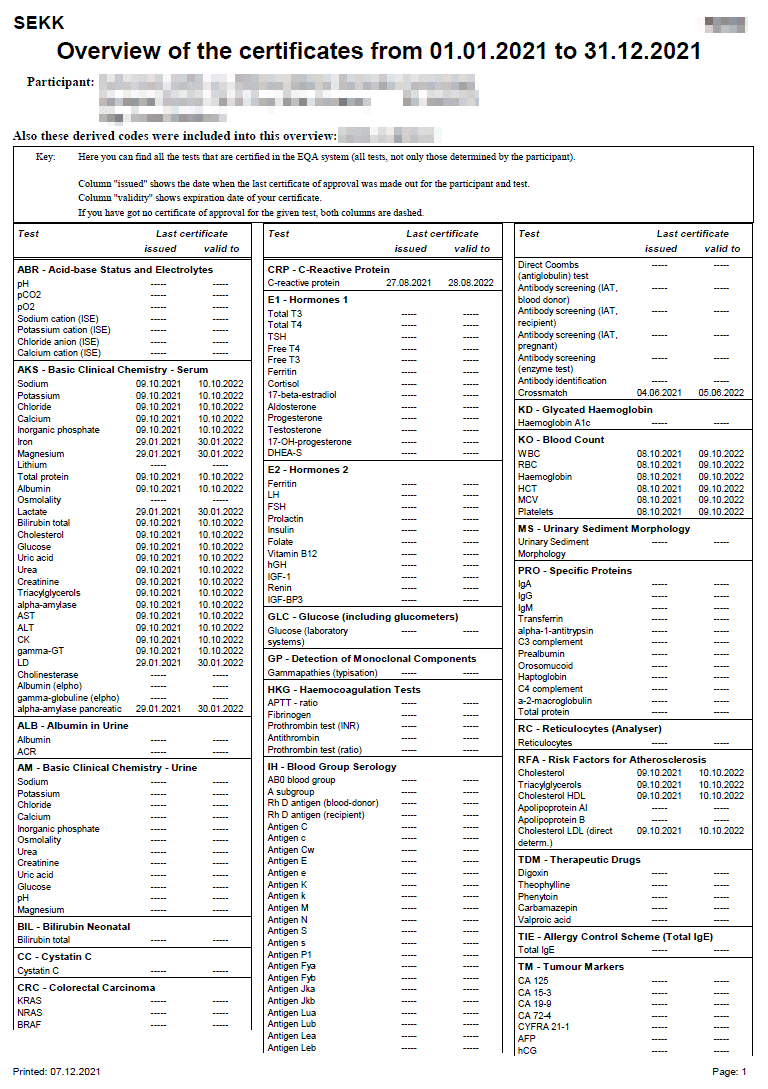
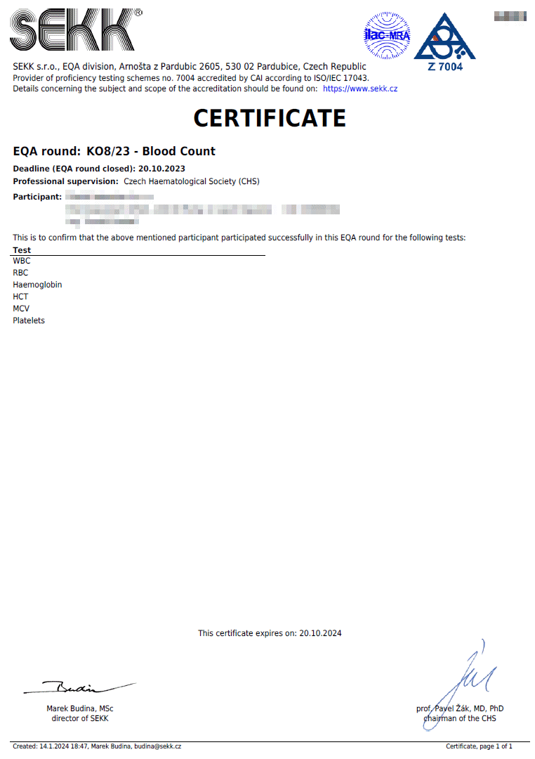
Certificate
|
|
The conditions defining the rules for issuing certificates are defined in the EQA Plan for the relevant year.
The certificate is issued only for some tests of some programmes and only for tests where the participant succeeded.
The criteria for certification you can find in the Infoservice section in the Certification xxxx documents (where xxxx is a year of validity).
|
|
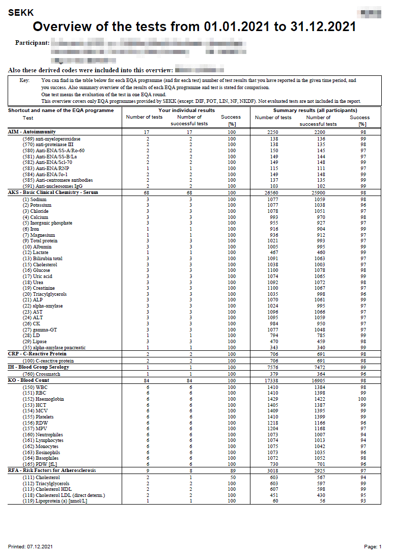
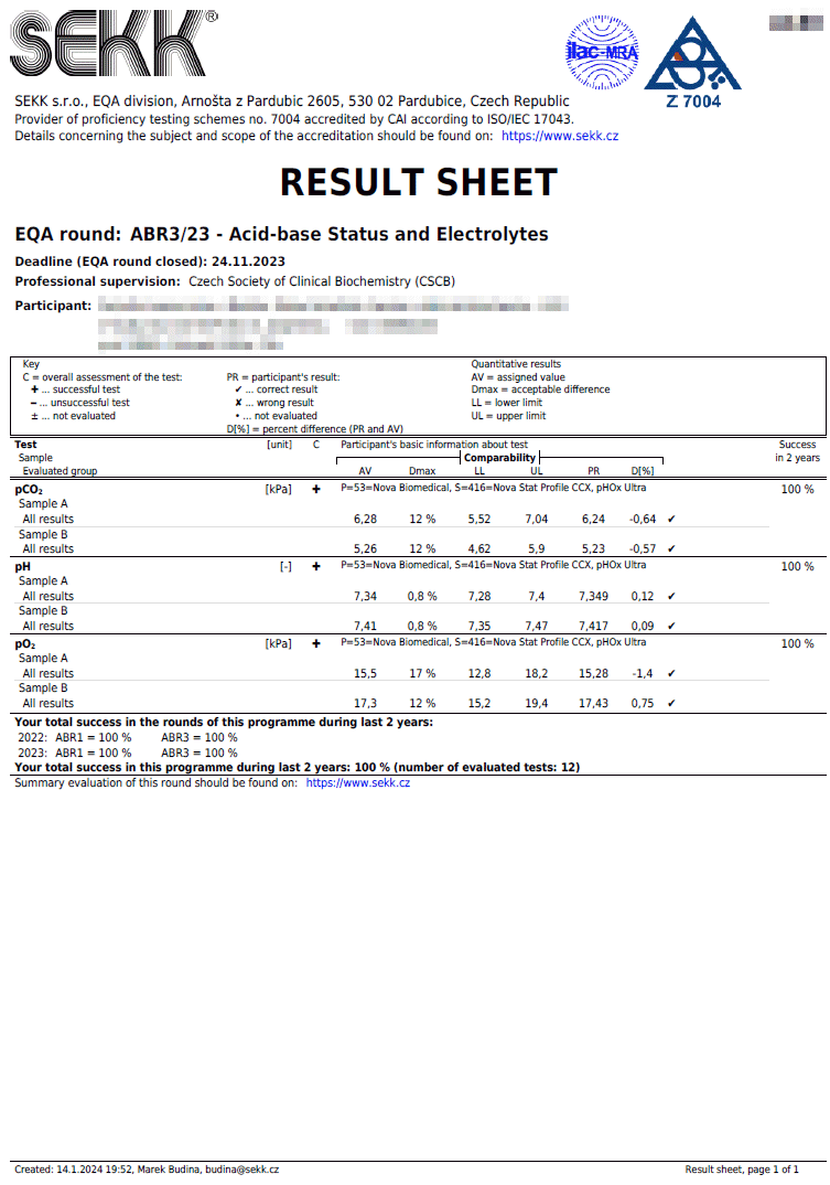
Result sheet (quantitative results)
|
|
Result sheet of a programme where participants report only quantitative results.
|
|
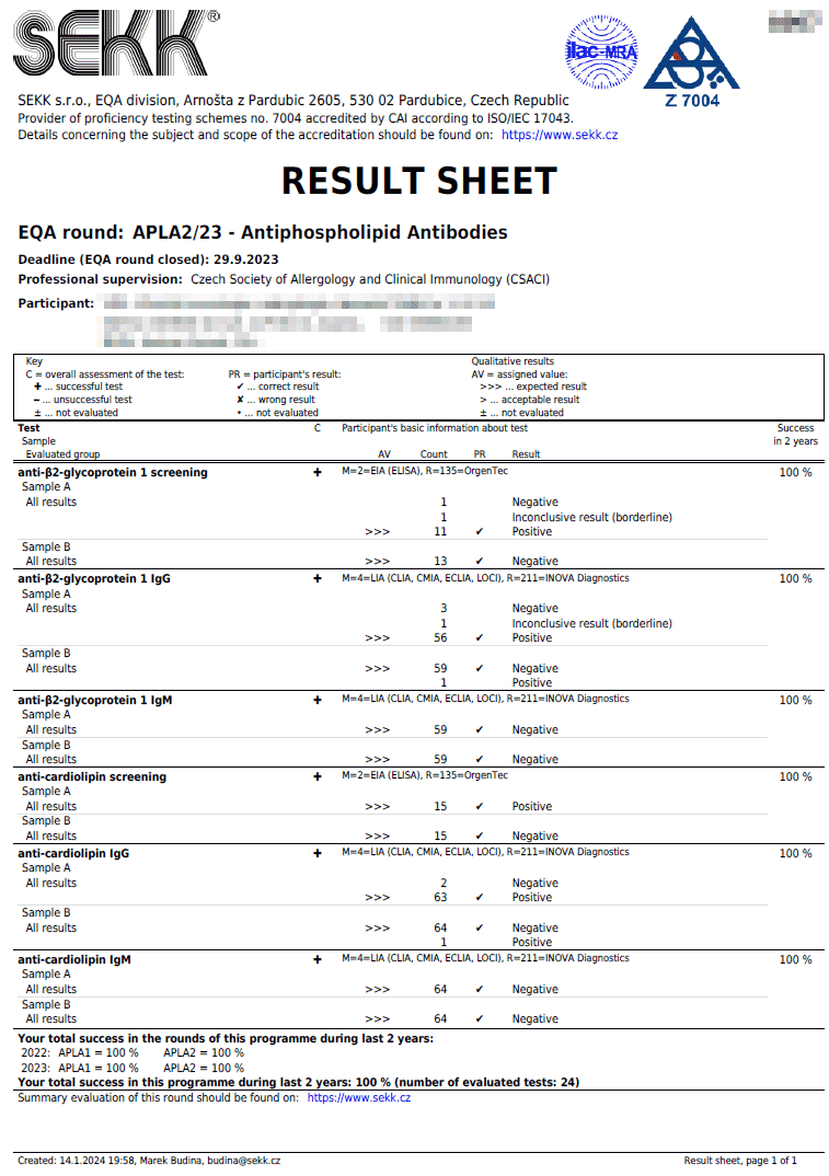
Result sheet (qualitative results)
|
|
Result sheet of a programme where participants report only qualitative results.
|
|
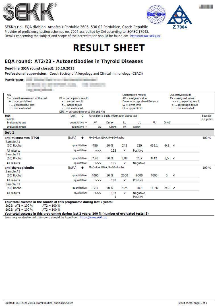
Result list (quantitative and qualitative results)
|
|
Result sheet of a programme where participants report quantitative and qualitative results.
|
|
Complex statistics
|
|
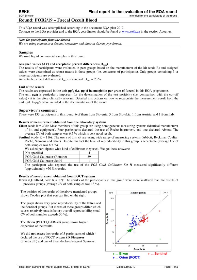
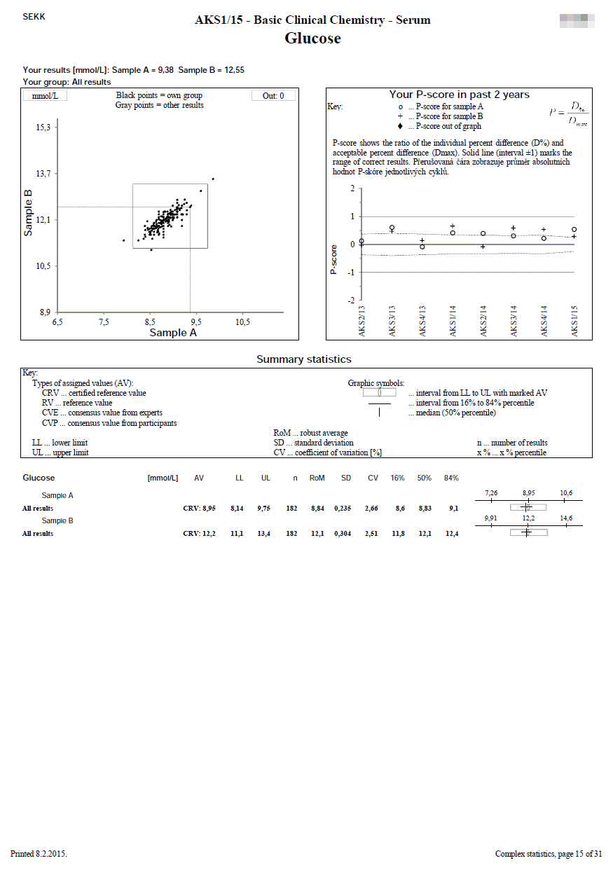
We use this document in programmes where 2 samples are measured.
The first line shows the EQA round identification and the participant code. The name of the test is printed on the second line. In the upper left part, the participant's results are printed, as well as the identification of the group in which the participant's results were evaluated (e.g. "all results" or a group identified by the use the same measurement principle and reagents of one manufacturer, etc.).
The remaining part of the sheet can be divided into 3 relatively independent parts, the content of which is described in the following lines:
- Youden plot (top left)
It displays the results of all participants of the round - the x-axis represents the results for sample A, the y-axis for sample B. If there is a rectangle inside the graph, then this defines the area of correct results. Dots that show the results of participants who belong to the same evaluated group as the participant's results are printed in black. Other dots are printed in grey. The participant's own dot (results) is marked with a dashed line.
- P-score history for the last 2 years (top right)
Description of calculation and interpretation of P-score you can find here.
The P-score is also given if the participant's result belongs to a group that is not evaluated (i.e. a reliable assigned value is not available, e.g., because the group is not very small). The meaningfulness of the P-score in these cases can of course be discussed, however, we prefer the variant where we provide the participant with information (albeit with limited informative value) over the variant where the participant does not receive any information at all (P-score not specified - blank chart).
- Summary statistics (bottom half of the page)
Calculated statistical parameters are given for all results and also for individual independently evaluated groups.
Statistical parameters (SD, CV, etc.) are given only for groups with a frequency of at least n = 5.
In the column headed AV, you will find the type of assigned value that was used for the particular group evaluated (e.g. RV, CVP).
For programmes for which statistical calculations are performed over a common set of the results SEKK + other EQA provider, the statistics contains only those groups,
in which at least one of our participants is present. Complete statistics are available on the web.
|
|
Histograms
|
|
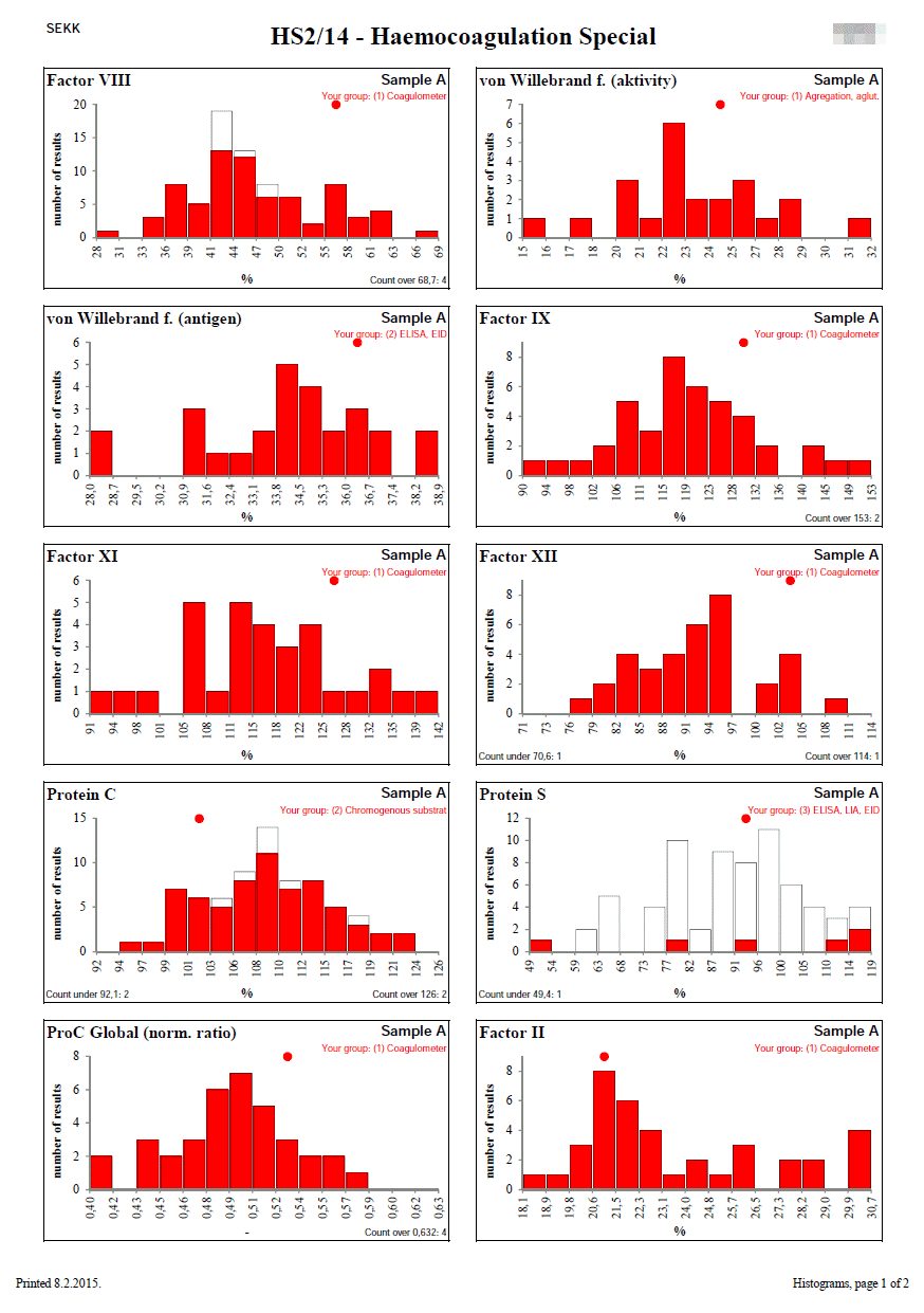
Histograms are designed to show the distribution of quantitative results in cases where Youden plots cannot be used.
This is especially the case when the number of samples used in the round is different from 2 or the results for one of the samples are close to zero.
Each column represents the number of results that lie in the interval described on the x-axis.
The white bars show the set of all results.
The red bars show the results of the participant's group (the group to which the participant's result belongs). The participant's group is described at the top right.
If any results are outside the range of the x-axis of the graph (left or right), their number is given in the lower left, resp. right corner.
The position of the participant's result is indicated by a red circle at the top of the graph. If the participant's result is outside the x-axis range of the graph, the circle changes to an arrow that indicates in which direction the participant's result lies.
|
|
Results with uncertainties
|
|
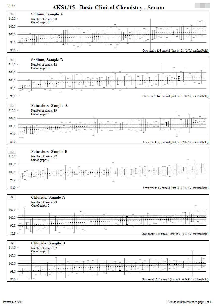
This document is only available to participants who have reported results including uncertainties.
One graph is given for each test and sample.
The title of the graph shows the name of the test and the label of the sample. Furthermore, there is the number of results displayed in the graph and the number of results that exceed the range of the x-axis of the graph (they are outside the graph).
The y-axis of the graph is always calibrated in %.
Reference values, uncertainties and participants' results are converted to %. The conversion is performed so that the assigned value is equal to 100 % and then all other data are converted to % using this value. The data converted in this way are then displayed in the graph as shown in the figure on the left. Thanks to this procedure, it is not necessary to construct a large number of graphs (for each evaluated group separately).
The middle horizontal line shows the position of the assigned value (AV = 100%). The dashed horizontal lines on both sides of this line show the expanded combined uncertainty of the assigned value (Uc,AV). The upper and lower solid lines define the range of acceptable results (Dmax)).
The results of the individual participants are displayed as ascending dots, each of them having a whiskers constructed on each side and representing the expanded combined uncertainty of the measurement result (Uc using the coverage factor k = 2). The participant's result is shown in the lower right corner of the graph and the participant's own result is marked in bold in the graph.
|
|
Basic interpretation of the position of individual result and its uncertainty should be found as a model example in the picture below:
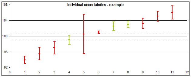
- Laboratories 1, 2, 10 and 11 reported results out of the acceptable difference (Dmax).
- Laboratories 3 a 9 reported results inside the range of acceptable results, but uncertainties of their determination (showing the range of probable true value) exceed the acceptable range (on one side). This shows that their successful result in this round contributed not only their good work, but also a piece of luck (probability that their result should lie outside the acceptable range, is not negligible).
- Extreme uncertainty value reported laboratory 5: Their result of measurement almost ideally agrees to the assigned value, but its uncertainty is so high, that the true value should lie outside the acceptable range (the uncertainty is unacceptably large compared to Dmax).
- • We can also consider the result of laboratory 6 to be extreme, which reported individual uncertainty much lower than other participants and lower than the uncertainty of the assigned value (dashed lines). It shows that the result seeming ideal should be considered fake.
|
|